

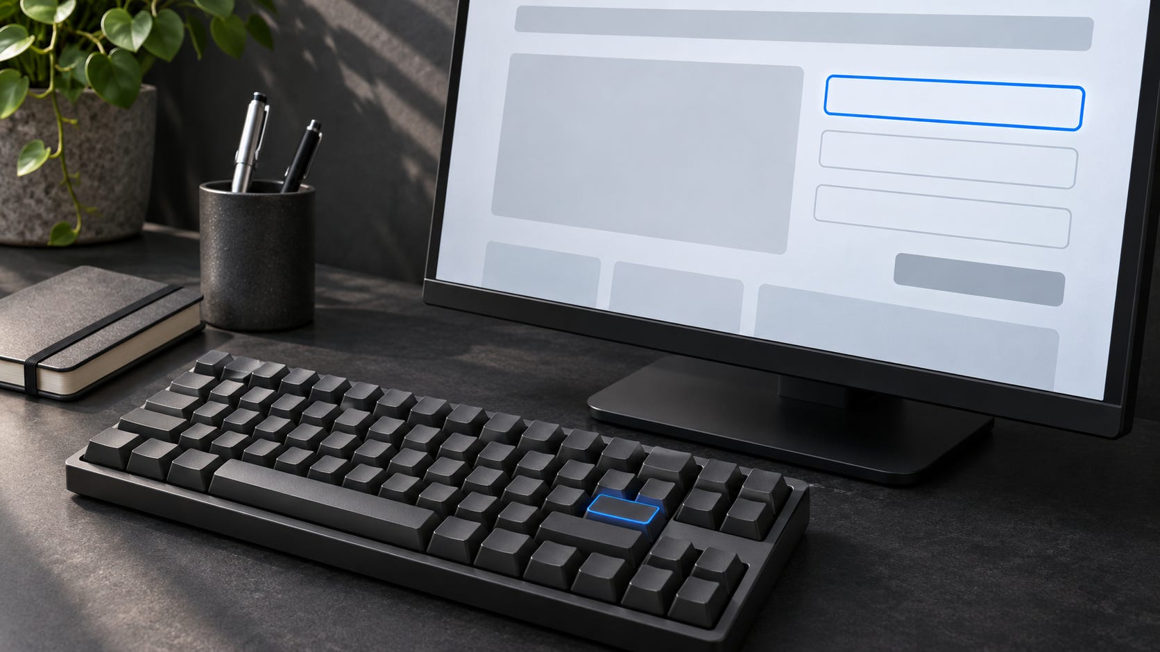
A website review should include the moment someone tries to correct a mistake without reaching for a mouse. That is where an attractive form can become a dead end. The error appears above the visible area, the keyboard stays on the submit button, and the visitor has no clear route back to the field that needs attention. An AI assistant can explain every component while missing that journey.
Consider a fictional repair workshop page with an information-request form. The visitor enters an email address and a question about a bicycle repair session. The demonstration stores nothing and sends nothing. Its chosen acceptance rule is that a person can complete the form using a keyboard, recover from invalid input and understand the local confirmation. This is a proposed review exercise, not a report of a tested production website.
Start by writing the task in terms the reviewer can observe. Open the page, reach the form, enter a malformed address and a useful question, submit, correct the address, then submit again. The question must survive the correction. The final message must say that the demonstration accepted the input and nothing was sent. Those requirements give the assistant a destination more precise than “make the page accessible.”
Keyboard operation has a standards basis. W3C's Keyboard guidance explains that functionality must work through a keyboard interface, apart from functions inherently dependent on a movement path. Entering an address and activating a submit control do not depend on drawing a path. The useful test therefore includes completing the action, not merely reaching something that looks like a button.
Record the browser, operating system, relevant keyboard settings and exact candidate revision before beginning. Those details let another reviewer reproduce the conditions. Start from a fresh page and use Tab to move forward, Shift-Tab to move backward and the appropriate activation keys for each control. Write down the actual sequence rather than assuming the visual layout predicts it. A custom control that requires unfamiliar behavior deserves closer inspection.
Watch the focus indicator throughout the route. The reviewer needs to know which element will receive the next action, including after scrolling and after validation. A momentary flash is poor evidence if the indicator disappears before the person can act. Record the precise control and state where focus becomes difficult to locate. “Keyboard navigation feels wrong” leaves the implementer guessing which behavior to repair.
The hypothetical failure is deliberately ordinary. Enter “reader” in the email field and “Can I bring a bicycle with a damaged wheel?” in the question field. Activate the submit control. Suppose a summary appears above the form, but focus remains below it and the page clears the question. These are invented observations for the worked checklist. They illustrate two separate acceptance failures: the correction route is unclear, and the visitor's completed work is lost.
The proposed repair moves focus to a concise error summary after unsuccessful submission, preserves both entered values and offers a link to the email field. That summary identifies the field and explains how to correct it. W3C's form notification tutorial describes clear feedback, error lists and ways to help users reach the affected controls. A focused summary is a design choice for this example, not a universal requirement for every form.
Discussion Topic:
Which part of your form review needs more attention: focus, error recovery, or zoom?
Follow the summary link using the keyboard and check where it lands. Correct the address to the synthetic value reader@example.test. Confirm that the bicycle question remains intact before submitting again. A reviewer should inspect the success state and the focus position after that transition too. Moving focus once does not establish that the rest of the journey remains usable.
Labels need their own evidence. Visible words beside a field can help a sighted reviewer while leaving the control without the intended programmatic association. Inspect the relationship between the label and the input, then check the accessible name exposed by the browser. Keep that inspection separate from an actual screen-reader test. An assistant reading markup cannot truthfully report what a screen reader announced unless that interaction was performed.
Zoom adds a different failure condition. Repeat the same correction path with enlarged content, including the error summary and confirmation rather than only the initial form. W3C's Reflow guidance specifies a width equivalent to 320 CSS pixels for vertically scrolling content, with exceptions for content that requires two dimensions. Its explanation relates that width to a 1280-pixel starting viewport at 400 percent zoom. Record the actual conditions used.
For this plain form, the acceptance expectation is straightforward: the labels, entered values, correction instructions and submit control remain available without forcing the reader to scroll sideways through each line. Check whether a fixed banner covers the focused field or whether an error message pushes the button out of reach. A narrow screenshot of the untouched page does not answer either question. The state that needs review is the one containing the mistake.
The takeaway checklist can fit on one review card. Record the revision and environment; the forward and backward focus sequence; visible focus at each required control; keyboard activation; label associations; the invalid-input response; preservation of entered values; correction and completion; and the same journey under zoom. Give each item an expected result, an observed result and an evidence location. Use pending when the check has not happened.
In the worked card, the malformed address should produce a reachable correction message while retaining the bicycle question. The corrected address should produce the honest local confirmation. The zoomed version should preserve that entire route. The hypothetical initial version fails recovery and value preservation; a proposed repair remains unverified until someone repeats those steps on its own revision. Copying the expected column into the observed column would erase the purpose of the card.
Automated checks can add useful findings to that record, but their output must retain its scope. A scanner report does not contain this visitor's completed keyboard journey merely because it lists no violations. Ask the assistant to keep automated results, code inspection and manual observations distinguishable. None should silently fill an empty cell belonging to another kind of evidence.
The human reviewer decides whether the tested scope is ready or needs specialist review. A successful pass on one synthetic form is not accessibility certification, and it does not establish behavior across every assistive technology or deployed environment. Unperformed checks stay visible beside the successful ones. Accept the form when the evidence includes a usable way back from the mistake.
If this was useful, forward it to one engineer who needs less noise in their feed.